MamaMingle
Overview
MamaMingle is a mobile app that supports new mothers with self-tracking tools, personalized information, and a thriving online community to navigate the emotional and mental challenges of pregnancy and postpartum.My Role
UX DesignerProduct Strategy, User Research, Interaction & Visual Design, Prototyping & Testing, PitchingTeam
Timeline: Jan - Apr 20233 UX Designers
1 UX Researcher
1 Product ManagerTools: Figma, FigJam, UserTesting
Still You Bloom in This Land of No Gardens
Art: © Njideka Akunyili Crosby Courtesy the artist, Victoria Miro, and David Zwirner.
Our team found inspiration in Akunyili Crosby's artwork depicting the beauty of motherhood in Nigeria. We wanted to support new mothers from marginalized communities facing challenges like poverty and mental health issues. Our goal was to help them thrive in resource-limited environments, “in the land of no gardens”. So we created MamaMingle - a personal guide for self-tracking and fostering social support during pregnancy and post-childbirth. We discovered that new mothers struggle to find community groups, so MamaMingle helps them stay connected.
Inspiration
Challenge
New mothers face a barrage of challenges, from tracking their health and baby's development to managing information and finding support. MamaMingle tackles these issues by providing a one-stop app for self-tracking, personalized information, and a supportive online community.
How might we improve social support and access to personalized resources for new mothers and pregnant women in underserved communities?
Design Process

Product Features


product features ideation
Home Page
The Home Page is focused on the new mother’s unique needs both during and after pregnancy, helping her keep track of a variety of factors based on her own progression through pregnancy and postpartum.
Community Page
"It's crucial to have a supportive community of other mothers who know what you're going through."
The Community Page is the heart of the app. Mothers can join groups that align with their own experiences and support needs.
Information Page (my primary responsibility)
"Breastfeeding has been the most challenging part. I didn't know how challenging it would be. I had to do a lot of learning and gather information."
The Information Page provides resources that are also customized to the mother’s unique needs and issues she may be facing due to a lack of support or resources.
Products Page
"This stroller brand is so amazing and popular online."
The Products Page features products that align with the needs identified by the new mothers throughout their app experience. Drawing inspiration from Akunyili Crosby’s piece, envisioned the app to feature products from Black-owned and environmentally friendly brands.
User Research
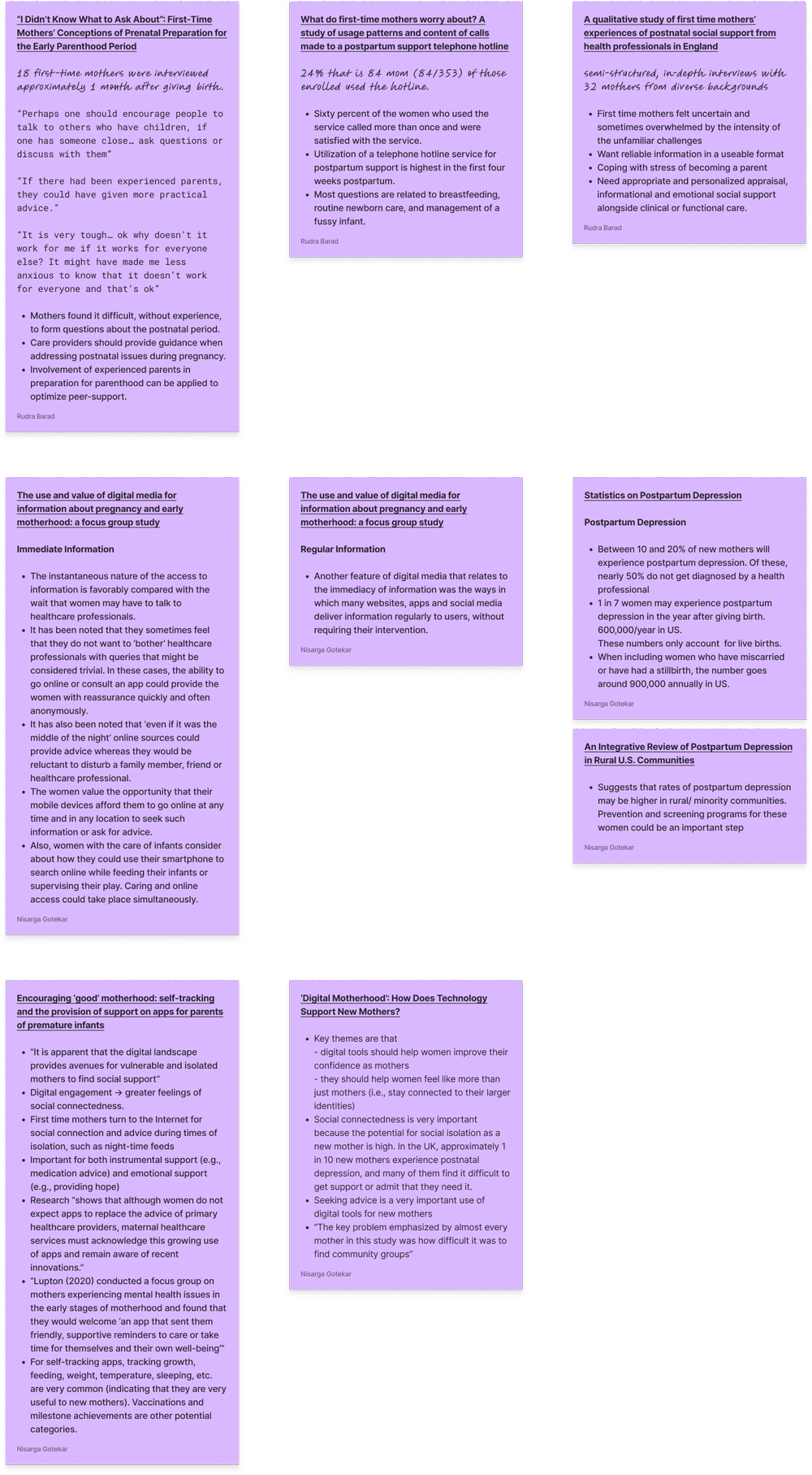
Necessities | Problems | Cure
App Features

Users

Competitors

Story Mapping
To build on our initial lo-fi wireframes, we underwent an iterative story mapping process to expand our conceptualization of potential users of the MamaMingle application and update our prototypes with features and design elements to meet the needs of this range of potential users.
Mid Fidelity Prototype
Home

Community
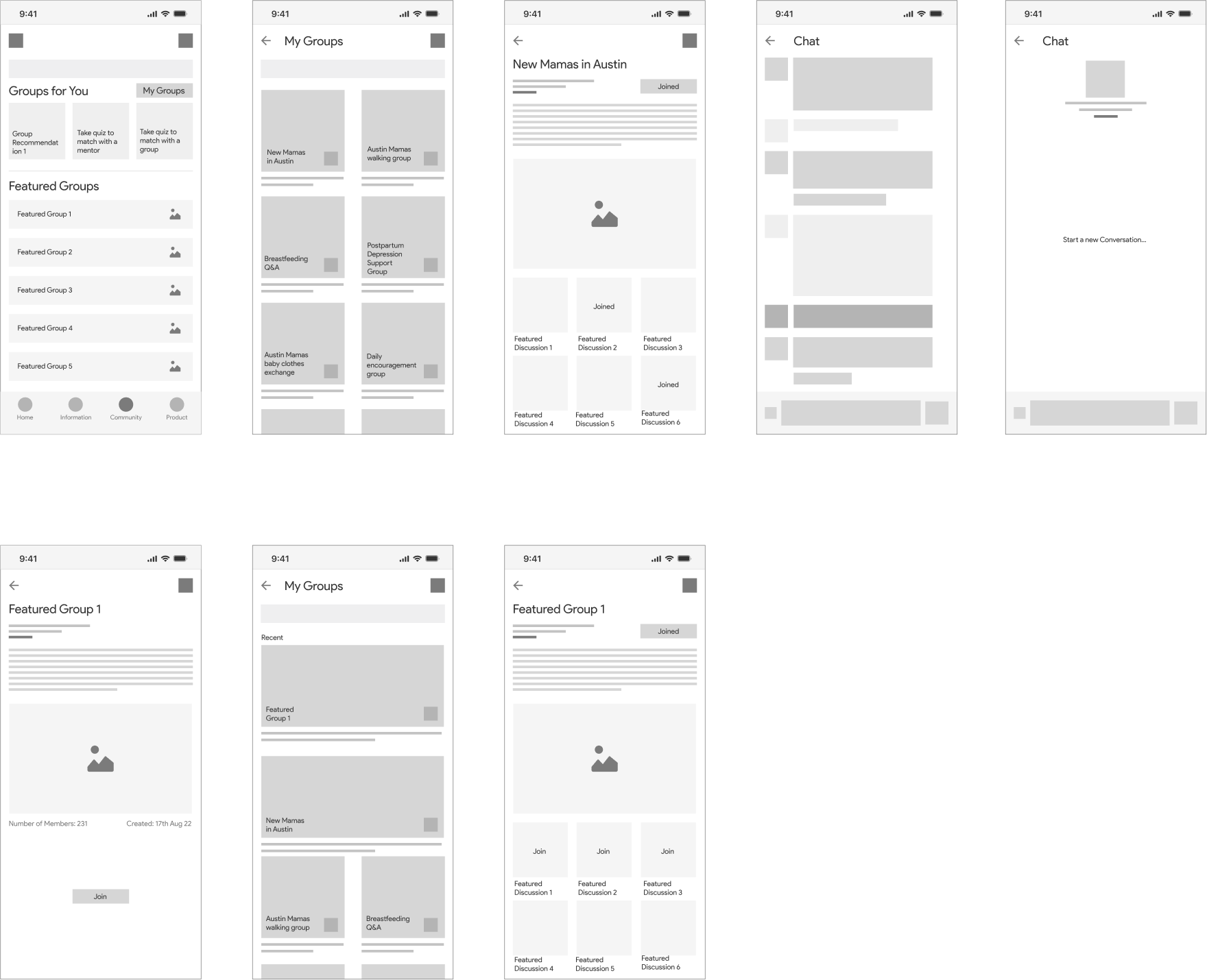
Information

Product

Aesthetics
To bring our lo-fi prototype to life, the team began creating mood boards to hone individual ideas on the aesthetic and feel of the app.
We considered images, color palettes, material samples, and descriptive words to capture the essence of our app. It was followed by discussion of mood boards, identifying elements that we wanted to incorporate into the final prototype by considering what we wanted to convey, what might resonate with users, and what would be aesthetically pleasing.
Created a hifi prototype with detailed attention to color, typography, iconography, layout, and navigation. We also include a design system along with our prototype. The design system consists of a color palette, typefaces, icons, and a grid layout.
Moodboard


Color Palette
We made the collective decision to keep black as our primary color and use a variety of different light-shade pastel colors as our secondary colors. We made this decision because information is a major aspect of the application and it will contain multiple images and illustrations derived from diverse informational resources. Using a range of background colors to showcase these images will help underscore the breadth of content within the app. Additionally, a range of pastel colors not only allows us to convey energy and vibrancy, but the light shades prevent the designs from being loud or overwhelming.

Logo Ideation
After finalizing our color palette, we then moved ahead to create a logo for our application. We first went on the internet and explored various illustrations and images for inspiration. As we needed to stick to the course objectives we prioritized the user experience of our application over creating specific illustrations at the time. And so, we picked 2 illustrations from numerous photos and vectors available online. We wanted to center our application around these illustrations as they effectively spoke about the purpose of the product. The logo was made using Golden Circle (plugin that calculates the sizes and position of your selected items automatically) on Figma.
After a very quick discussion and using dot voting, we finalized 2nd variant as our Logo

Design System
After agreeing upon the color scheme and logo, we turned to our design system. None of our team members had previously created an advanced design system from scratch, thus we faced some difficulties learning and applying the concepts. In particular, creating component sets proved to be quite time-consuming.
Typeface: Noto Sans typeface conveys a modern and clean aesthetic. It has a neutral and approachable feel that makes it suitable for conveying information in a clear and concise manner without distracting the reader with ornate or overly stylized features.


Hi Fidelity Screens


1:1 Interviews
Pregnant
Mothers of one
Mothers of two
20 women
Zoom
UserTesting.com

Product Iterations

analyzing interview data using severity ratings